Monday 25 July 2016

Excel- XOR the exclusive OR

Tea or Coffee? Seems to be a simple question but is the OR inclusive or exclusive? Can you have both tea and coffee? Or are you being offered the option of having a drink and it can be either tea or coffee but not both. In practice, it's an inferred exclusive OR as you are given a cup and saucer and offered a choice of drinks. Maybe you can have both if they come round again.

Tea or Coffee?

Milk and Sugar? Logically speaking, this question is not an AND, this is an OR. An inclusive OR; you can have milk or you can have sugar or you can have both. Struggling with Excel's logical functions AND, OR and NOT for our IF formulas is hours of fun and the exclusive OR condition is one of the hardest to formulate. In a two horse race, one of the two will win but not both.

This one or that one, but not both

Microsoft Excel 2013 introduced the XOR function which now completes the set of logical functions. Although it's somewhat specialised, you can now easily express the exclusive OR condition.

In its simplest and most useful form XOR contains two logical arguments and returns TRUE if either argument evaluates to TRUE. If both arguments are TRUE or neither is TRUE, XOR returns FALSE.

Where more than two logical arguments are added, XOR returns TRUE if an odd number of arguments evaluate to TRUE. And FALSE if an even number of arguments evaluate to TRUE. FALSE if all are FALSE.

10% discount if the Product is Soap or if the Country is UK.

In the above example, we calculate 10% of the Value column C if either the Country in column A is "UK" or if the Product in column B is "Soap". But not when the Country is "UK" and the Product is "Soap". One or the other but not both. Using XOR the formula is (fairly) straightforward:

=IF(XOR(A2="UK",B2="Soap"),C2*10%,0)

The OR function is no good for this calculation as the 10% discount would be calculated where both the Country and Product logical tests were TRUE:

=IF(OR(A2="UK",B2="Soap"),C2*10%,0)

Without an XOR function and using only the IF, NOT, AND and OR functions the formula would have to be entered as follows:

=IF(AND(OR(A2="UK",B2="Soap"),NOT(AND(A2="UK",B2="Soap"))),C2*10%,0)

Related Posts

Tuesday 12 July 2016

Excel Dashboards with Power View

Creating Excel Dashboards with Power View

Microsoft Power View
There's a new add-in to look for errors and inconsistencies between worksheets and Power View – which used to be a Silverlight-based web tool for exploring and visualising data that you could use with SharePoint or save as PowerPoints – is now in Excel where it belongs. It's not relegated to a separate window; when you insert a Power View you get a new tab and the tools for pivoting and filtering data, plus simple layout options.

The feature that’s generated much excitement among those working in business intelligence is Power View. Only available in the Office Professional Plus version, it has the ability to turn a mass of data into meaningful graphics – ideal if you need to present complex information such as sales by location, especially as you can integrate Bing Maps. Coupled with the PowerPivot add-in, it turns Excel into a genuine business intelligence tool, giving even small businesses the means to intelligently analyse their data – and act on it.

Have you ever looked at a dashboard someone made and went, “man, I like that, but there’s too many steps for me to remember”? Or maybe wanted to have a way to play around with your data in a safe space so you don’t mess it up? Power View is a new add-in for Excel 2013 that consumes the Data Model. For those who are avid readers of our blog, you will remember Diego did a post on the Data Model we’ve integrated into Excel. If you don’t remember that post (because not all of us are perfect), the gist is that there’s a new way to have lots of data in Excel and not slow it down while also having handy things like relationships (to make your handy dandy new in-workbook cube relational). Another thing to note is that the Power View add-in comes installed by default in Professional Plus versions of Office. The point of Power View is to make it very easy to create pretty, interactive data presentations (or “reports” as the experts call them) that will make your boss go “Wow, how did you do that? You’re a genius!” 

Well, OK, maybe not that far but you’ll definitely look super smart. Plus, it also can be used to explore your data visually without worrying about messing anything up and even make reports on your own, without IT help. Some of you may be quizzical and asking yourselves, “But… Doesn’t Excel already have graphs and charts and visualisations?” To which I would say, “Yes!!” and probably also add that with Power View, you get automatic cross-filtering of visualizations, new visualizations that aren’t in Excel (such as a "play" axis, maps, and cards), a free-form canvas that doesn't have the restriction of gridlines (no more messing up alignment because you inserted a new row!), unique filtering options (e.g. sliders), and support for images. Plus, if you’re a data head, you’ll be excited to know that Power View sheets in Excel can also be hooked up to external data models (i.e. Analysis Services Tabular Models). Then there are the new Apps for Office, which allow users to quickly add extra features via an online store. Apps are currently thin on the ground, but the Bing Maps tool shows what can be done, taking a list of locations and plotting them on a map for you.

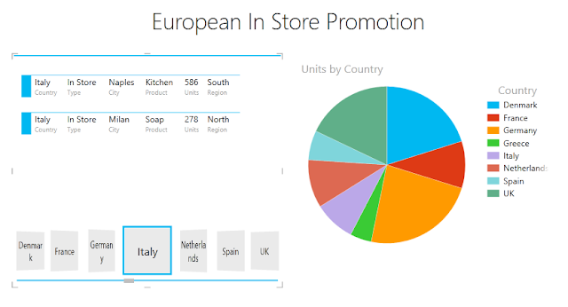
Excel dashboard generated by Power View

Where is Power View?

IMPORTANT: Power View and Power Pivot are only available in the Office Professional Plus and Office 365 Professional Plus editions, and in the standalone edition of Excel 2013.

Turn on the Power View add-in from Excel Options

If the Power View icon is grayed out on the Excel Insert menu, you can still turn it on.

Go to File > Options > Add-Ins.

In the Manage box, click the drop-down arrow > COM Add-ins > Go.

Check the Power View check box > OK.

Start Power View the first time

The first time you insert a Power View sheet, Excel asks you to enable the Power View add-in.

Click Enable.

Power View requires Silverlight, so the first time, if you don’t have Silverlight:

Click Install Silverlight.

TIP: Install Silverlight from Internet Explorer rather than other browsers.

After you have followed the steps for installing Silverlight, in Excel click Reload.

Turn on Power View in Excel 2016 for Windows

Applies To: Excel 2016 The Power View button in the Reports group has been removed from the ribbon in Excel 2016 for Windows. The interactive visual experience provided by Power View is now available as part of Power BI Desktop. All the functionality of Power View is available and will continue to be supported in Excel 2016. To turn on Power View, follow the steps below.

First, you'll need to customize the ribbon, and then turn on the Power View add-in.

Customize the ribbon

On the File tab, > Options > Customize Ribbon.

File > Options > Customize ribbon

Under Main Tabs, click the tab where you want to add the new group, and then click New Group.

New Gtroup button in the Customizr Ribbon Excel options

Under Choose commands from, click Commands Not in the Ribbon, and then in the list, pick Insert a Power View Report.

Customize the ribbons box in Excel

With both Insert a Power View Report and New Group (custom) selected, click Add, and then move the New Group (custom) to where you want it on the ribbon.

Add button in the Customize Ribbon dialog in Excel

Click New Group (custom), > Rename, and then in the Display Name box, type Reports or the group name you want.

Rename button in Customize Ribbon dialog

Click OK twice.

Turn on the Power View add-in

The first time you insert a Power View sheet (click the ribbon button you added), Excel prompts you to turn on the Power View add-in.

Custom Pivot View button and dialog turning on the add-in in Excel

Click Enable.

NOTE: The new option, File > Options > Advanced > Enable Data Analysis add-ins: Power Pivot, Power View, and Power Map activates the COM Add-ins, but will not add the Power View command to the Insert tab. To see the Power View command in the ribbon, you need to follow the steps in Customize the ribbon section above.


There's a new add-in to look for errors and inconsistencies between worksheets and Power View – which used to be a Silverlight-based web tool for exploring and visualising data that you could use with SharePoint or save as PowerPoints – is now in Excel where it belongs. It's not relegated to a separate window; when you insert a Power View you get a new tab and the tools for pivoting and filtering data, plus simple layout options.

The feature that’s generated much excitement among those working in business intelligence is Power View. Only available in the Office Professional Plus version, it has the ability to turn a mass of data into meaningful graphics – ideal if you need to present complex information such as sales by location, especially as you can integrate Bing Maps. Coupled with the PowerPivot add-in, it turns Excel into a genuine business intelligence tool, giving even small businesses the means to intelligently analyse their data – and act on it.


Using Excel's Internal Data Model

Have you ever looked at a dashboard someone made and went, “man, I like that, but there’s too many steps for me to remember”? Or maybe wanted to have a way to play around with your data in a safe space so you don’t mess it up? Power View is a new add-in for Excel 2013 that consumes the Data Model. For those who are avid readers of our blog, you will remember Diego did a post on the Data Model we’ve integrated into Excel. If you don’t remember that post (because not all of us are perfect), the gist is that there’s a new way to have lots of data in Excel and not slow it down while also having handy things like relationships (to make your handy dandy new in-workbook cube relational). Another thing to note is that the Power View add-in comes installed by default in Professional Plus versions of Office. The point of Power View is to make it very easy to create pretty, interactive data presentations (or “reports” as the experts call them) that will make your boss go “Wow, how did you do that? You’re a genius!” 

Well, OK, maybe not that far but you’ll definitely look super smart. Plus, it also can be used to explore your data visually without worrying about messing anything up and even make reports on your own, without IT help. Some of you may be quizzical and asking yourselves, “But… Doesn’t Excel already have graphs and charts and visualisations?” To which I would say, “Yes!!” and probably also add that with Power View, you get automatic cross-filtering of visualizations, new visualizations that aren’t in Excel (such as a "play" axis, maps, and cards), a free-form canvas that doesn't have the restriction of gridlines (no more messing up alignment because you inserted a new row!), unique filtering options (e.g. sliders), and support for images. Plus, if you’re a data head, you’ll be excited to know that Power View sheets in Excel can also be hooked up to external data models (i.e. Analysis Services Tabular Models). Then there are the new Apps for Office, which allow users to quickly add extra features via an online store. Apps are currently thin on the ground, but the Bing Maps tool shows what can be done, taking a list of locations and plotting them on a map for you.

Creating an Excel Power View Dashboard

After you have data in your internal Data Model, you can create a Power View dashboard from that Data Model. Just go to the Ribbon, click the Insert tab, and click Power View. Excel takes a moment to create a new worksheet called Power ViewX, where X represents a number that will make the sheet name unique (for example, Power View1). This new worksheet has the three main sections shown in Figure 17-20: Canvas, Filter Pane, and Field List.

The canvas contains the charts, tables, and maps you add to your dashboard. The filter pane contains the data filters you define. You use the field list to add and configure the data for your dashboard.

The three main sections of a Power View worksheet

You build up your Power View dashboard by dragging the fields from the field list to the respective sections. For example, dragging the Generator_Size field to the filter pane creates a list of filterable items (see Figure 17-21) that can be checked and unchecked. The filter pane has a few icons that help
you work with the filters. These icons enable you to expand or collapse the entire filter pane, clear applied filters, call up advanced filter options, or delete the filter.

Figure 17-21: The filter pane has a few icons that help you work with the filters.

To add data to the canvas, use the field list to drag the needed data fields to the FIELDS drop zone. In Figure 17-22, you can see that the Waste_Code field and the Generated_Qty field have been moved to the FIELDS drop zone. This results in a new table of data on the canvas.

Figure 17-22: Use the field list to drag data fields to the FIELDS drop zone, resulting in a table on the canvas. Creating and working with Power View charts All data in Power View starts off as a table, as shown in Figure 17-22. Again, dragging fields to the FIELDS drop zone creates these tables. After you have a data table on the canvas, you can transform it into a chart by clicking it, selecting the Design tab, and choosing a chart type. Figure 17-23 demon- strates the selection of a Clustered Bar chart.

Figure 17-23: Transform data tables in the canvas by selecting the table and choosing a chart type on the Design tab. In Figure 17-24, note that after the data is converted to a chart, new drop zones appear in the field list. These new drop zones are used to configure to the look and utility of the chart.

Figure 17-24: When your table is transformed into a chart, new drop zones appear in the field list. When you click a Power View chart, a context menu appears above the chart. With this menu, you can sort the chart series, filter the chart, and expand/collapse the chart to full screen (see Figure 17-25).

Figure 17-25: Clicking a Power View chart activates a context menu for that chart. 

When you select a chart in the Power View canvas, the filter pane provides a CHART option. Clicking that link allows you to see and apply custom filters to the selected chart. Figure 17-26 demonstrates filtering by the Generated_Qty field using a nifty slider.

Figure 17-26: You can use the filter pane to apply chart-specific custom filters.

You can slice your chart series by dragging a new data field into the LEGEND drop zone. In the example shown in Figure 17-27, the On_Site_Management field is placed in the LEGEND drop zone; as a result, the original chart is sliced by the data items in the newly placed field.

Figure 17-27: Use the LEGEND drop zone to slice your chart series.

Alternatively, you can use the VERTICAL MULTIPLES or the HORIZONTAL MULTIPLES drop zone to turn your original chart into a panel of charts. Figure 17-28 illustrates how your original chart has been replicated to show a separate chart for each data item in the On_Site_Management field.

Figure 17-28: Dragging the On_Site_Management field to the VERTICAL MULTIPLES drop zone creates a panel of charts.

Another neat trick is to add drill-down capabilities to a chart, which you do by dragging a new data field to the AXIS drop zone. Figure 17-29 shows the Gen_State field dragged to the AXIS drop zone. Initially, it will seem as though nothing happened. But in the background, Power View has layered in the newly selected field as a new category axis. Figure 17-29: Dragging a new field to the AXIS drop zone creates a drill-down effect.v After you add your new field to the AXIS drop zone, double-click any data point in the chart. The chart automatically drills into the next level. In this case, because you added Gen_State (generator state) to the AXIS drop zone, the chart drills down to show the breakdown by state for the data point that you double-clicked (see Figure 17-30). Note the arrow icon that allows you to drill back up.

Figure 17-30: With multiple data fields in the AXIS drop zone, you can drill into the next layer of data and then drill back up using the arrow icon. You can create as many charts as you want to your Power View canvas. And as mentioned at the beginning of this chapter, all components in the Power View window are automatically linked so that they respond to one another. For instance, Figure 17-31 shows two charts on the same Power View canvas. Clicking the pie slice for Arkansas (AR) dynamically recolors the bar chart so that it highlights the portion of the bar that’s made up by the Arkansas data — all without any extra work from you! Figure 17-31: Charts in a Power View dashboard automatically respond to one another.

Visualising data in a Power View map

The latest buzz in the dashboarding world is location intelligence: visualising data on a map to quickly compare performance by location. Since Excel 2003, we haven’t had a good way of building map-based visualizations without convoluted workarounds. Excel 2013 changes all that with the introduction of Power View maps. To add a map to your Power View dashboard, follow these steps:v 1. Start with some location data in the Power View canvas.

Figure 17-32 illustrates some Zip Code data from your Data Model. Figure 17-32: Add location data to your Power View canvas. 2. With your location data selected, click the Design tab.

3. Choose Map from the Switch Visualization group (see Figure 17-33).

Figure 17-33: Choose to show the data as a Map.

After a moment of gyrating, Excel generates a Bing map.

As you can see in Figure 17-34, the initial map will often be fairly useless. How Excel decides to initially handle your data is a bit of a black box and varies from data set to data set. You typically need to make some adjustments to get the view you need.

Figure 17-34: Excel generates an initial Bing map.

After you create your map, try moving your location field to the different drop zones in the field list. The drop zone you end up on will vary according to how you want to see your data. In this example (see Figure 17-35), moving the Gen_Zip field to the LOCATIONS drop zone fixes your map and creates a nice view of your data by Zip Code. Figure 17-35: Moving the Gen_Zip field to the LOCATIONS drop zone creates a nice view by Zip Code.

You have limited control over how your map looks. With your map selected, you can go to the Layout tab and customize the map title, legend, data labels, and map background (see Figure 17-36).

Figure 17-36: The Layout tab provides a limited set of options for customizing your Power View map. The map is fully interactive, allowing you to zoom and move around using the buttons at the top-right corner of the map, as illustrated in Figure 17-37.v Figure 17-37: You can interactively zoom and move around on the map. You can use the COLOR drop zone to add an extra layer of analysis to your map. For instance, Figure 17-38 demonstrates how adding the Waste_Code field to the COLOR drop zone differentiates each plotted location based on waste code. www.it-ebooks.info

Figure 17-38: Add data fields to the COLOR drop zone to add an extra layer of analysis to your map.

Changing the look of your Power View dashboard


Excel grants you limited control over how your Power View dashboard looks. On the Power View tab (see Figure 17-39), you see a Themes group. Here you can set the overall font, background, and theme for your Power View dashboard.

Figure 17-39: Changing the theme of your Power View dashboard. The theme you choose changes the colors for your charts, backgrounds, filters, tables, and plotted map points. The Bing map will not change to match your theme. Figure 17-40 illustrates a full Power View dashboard with an applied theme. Figure 17-40: A completed Power View dashboard with an applied theme. 


Sunday 10 July 2016

PowerPoint- Displaying Text on Photo Backgrounds

Chiaroscuro

A slide with a photo background can be both memorable and compelling as photographs are so good at capturing mood. Photos can also be very effective as fills for objects. The problem comes when you want to overlay text on the photograph as the strong contrast between light and dark—the chiaroscuro—can make your text difficult to read. Chiaroscuro is inevitable in photographs as you must have the contrast of light to achieve a sense of volume for three-dimensional images.

White text partially washed out by the light background elements

This is a typical example, we want to overlay some white text upon a photo background and the image has a lot of “noise”,  most of it is dark enough to provide an adequate contrast to the text but parts of the text are washed out by the lighter elements of the background. You need a strategy to make that text readable and there's a few different methods commonly used:

  • Picture Tools to change the photo image to provide a better contrast with the text overlay by blurring or darkening. Obviously, this dramatically changes the photograph.

  • Floor Fade to keep the photograph much the same but darkening the section where the text is located (usually at the bottom) with a gradient overlay.

  • Invisible Mask to keep the photograph exactly the same but make the text readable using a text shadow and an almost invisible background mask. This is my favourite method as it preserves the colour balance of the photograph and is the easiest.

Picture Tools

PowerPoint's picture tools are available on the Picture Tools tab, Adjust group. Using a combination of the Corrections, Color and Artistic Effects controls you can dramatically change the photo image by changing the saturation and temperature of the colours, apply special filters and adjust the contrast and softness of your picture. Blurring or darkening the image will always provide a better contrast for text overlays.

PowerPoint Picture Tools

Lightening and darkening effects of PowerPoint Picture Tools

Floor Fade

A floor fade is where you add a transparent gradient layer over your image that subtly fades towards black or dark grey at the bottom, where you place your text. This fade will make your image look quite natural to the eye as the image is slightly darker at the bottom and the light will be coming from the top. It usually needs a bit of experimentation to get the level of transparency right.

This floor fade is a bit too dark, we need to increase the transparency


To create the overlay, draw a shape either over the object with the photo fill or draw a rectangle over the entire slide if you are dealing with a photo background. The overlay is placed over the photo but behind the text in the stacking order. Then format the shape, choose a Gradient Fill, the Type is Linear, the Direction is Linear Up and the colour is black or dark grey and a Transparency of around 50%-60% is usually about right.

Right-click the overlay, choose Format Shape and then Fill


Invisible Mask

This is the one works best for me as it is so easy to do and requires far less flaffing around and experimenting in comparison to the other two methods. This method is a two-step formatting job. The first step is to apply a shadow to the text and then you format the background of the text box to black with a 95% transparency.

Background too busy for the text overlay

Here's the usual problem, parts of the text are readable but the lighter areas of the picture are too pale to provide sufficient contrast for the text to stand out.


Shadow format for the text

The Text Shadow control is no more than a hop over to the left from the Font Color control on the Home tab so you click the border of your text box, choose white text and then shadow. Already the text is looking more readable but it needs the mask to really make it pop. 

Black background for the text

A black fill colour for the text box certainly makes the text stand out but destroys the idea of the text being overlaid on the photograph. We shall soften it so that it forms a darkish background for the shadow.

95% transparency, the magic mask

Ninety-five percent seems to be the magic number for most backgrounds. 85%-90% is far too dark and anything over 95% has no effect. The mask is there, it's visible if you really look for it, most people will not notice it but they will be able to read your text.

I don't usually do the fill colour and then set the transparency in separate steps—I just wanted to illustrate the effect. All you need to do is right-click the text box and choose Format Shape from the shortcut menu.

This method of creating a faint dark background to help a lighter element stand out is an old trick from traditional woodblock printing. It's got a proper name but I can't remember it. So I always call it the "magic mask". I thought you'd be impressed enough already that I'd remembered the word chiaroscuro.

The magic mask, it's only there if you look for it


Related Posts

Saturday 9 July 2016

PowerPoint- Name those Slides

Someone once advised me to make a list of the slide numbers of the slides in my presentation and their subject matter so that, if someone asked me a question, I could easily refer back to that particular slide. Hmm, I thought, nice idea but wouldn't it be better to name them, then I could name my slide, say "New Ideas" rather than have to remember that it was Slide 4 in the deck. And, of course, I could use these names in hyperlinks.

Naming PowerPoint Slides

You may find that your slides are already named, especially if you have planned your presentation in the outline view as you are supposed to according to the "Way of PowerPoint". Any slide that has a Title text placeholder uses the text in the text box to name the slide. Every PowerPoint slide has a name property but there is no other way of setting it other than to use the title text placeholder. 

The reality is that most presentations do not get planned in the outline view, they tend to come together more organically and are often composed from blank or duplicated slides. The first thing is to determine if your slides are named, there's many different ways of doing this. My favourite method is to run the slide show and view the slide names in the way that I intend to use them.

Viewing the Slide names
To do this press F5 and then click the controls at the lower left hand corner of the screen to view the slide names. 

It's fantastic news for this presentation as we can see that all the slides are named so we will not have any problem identifying which slide is which and can easily jump around in our presentation.

This is usually not the case and you will probably find that some of the slides are named but many are not so you will have to go through the naming process, which is done in the Outline view and then the moving/hiding process which is done either in normal or outline view.


Outline View

For PowerPoint 2010, click on the Outline tab on the left hand side of the normal view to switch the normal display of thumbnails to an outline of your presentation. Each icon on the left represents a slide. In PowerPoint 2013 and later the Outline pane has to be turned on by clicking the Outline View control in the Presentation Views group on the View tab.

Outline view
Looking at the list of slides in the outline pane you will be able to see which slides have not been named. They were probably blank slides inserted into the presentation.

Click to the right of the icon and type in some text to name the slide. You can rename existing slides if you wish but remember that you are changing the text that is displayed on the slide.

You must have some title text on your slide but if you don't want to see it you can always hide it or move it off the presentation frame so that it does not display.

Having named your slides you can return to the normal view by clicking the Slides tab if you prefer to work in this more familiar Powerpoint view.


Moving or Hiding the Title Text

As soon as you name your slide you will see a title text box appears on the slide which may disrupt the beauty of your slide and you might want to get rid of it. Don't delete the text box or you will return to having an un-named slide. Either format it to match the background, move it off the slide onto the grey background so that it does not display or hide it. I prefer to hide my ones.

Hiding the title text using the Selection and Visibility pane

To hide your title text, press Alt+F10 to turn on the Selection and Visibility Pane. There’s a control to turn this on and off on the Home tab but it’s easily missed. This pane lists all the objects on your slide and you can easily identify your title text as the object, "Title 1". Click the eye to the right to hide it.

If you have many other slide objects and maybe some complicated animations going on, it's probably a good idea to rename "Title 1" as "Name tag" or something to make it more obvious. To rename an object, click the current name in the pane and replace the text. 

Related Posts

Friday 8 July 2016

Excel- Convert all your Formulas to Values

Formulas to Constants macro

Changing all the formulas in a workbook to values usually involves a tedious series of Copy and Paste Special, Values and your doing each worksheet separately. Try using this macro, it processes the entire workbook in a few seconds.  You don't need to know the first thing about macros to get it working. If you can copy and paste then that's all you need. This is what you need to do:
  1. Create a module in your Personal Macro workbook where the macro will be stored.
  2. Copy and Paste the macro code into your module.
  3. Save your Personal Macro workbook.
  4. Run the macro.
NB This version does not process array formulas, they remain untouched. Any protected sheets are ignored and the formulas are not converted. Please remember that you can not Undo a macro, once it's done, it's done. If you want to keep your original formulas then make sure that you save a copy of your original workbook file.

Create a module in your Personal Macro workbook 

Turn on the macro recorder and record into your Personal Macro workbook. It doesn't matter what you record because we are going to replace the recording with our own code in a moment but you need to have a module (a storage area for macros):

Recording into Personal
Click View tab, Macros and Record Macro. Don't worry about the Macro name or anything else apart from the Store macro in setting which should be Personal Macro Workbook which you can choose from the drop down list.

Click OK to start the recording and then click Stop Recording from the Macros control. You now have your module.


Copy and Paste the macro code into your module 

Select all the text from the section below and copy it (all the text starting with and including the words Public Sub down to and including the last line, End Sub) Now we need to switch over to your module and paste the code.

This is the code to copy and paste:


Public Sub FormulasToConstants()
    Dim wks As Worksheet
    Dim rngFormulas As Range
    Dim rngCell As Range

    On Error Resume Next

   'Outer loop; worksheets in workbook.
   For Each wks In Worksheets

      'Inner loop; formula cells on worksheet.
      Set rngFormulas = wks.Cells.SpecialCells(xlCellTypeFormulas,23)

      For Each rngCell In rngFormulas

        'Reduce cell entry to a constant.
        rngCell.Value = rngCell.Value

     Next rngCell

    Set rngFormulas = Nothing

    Next wks

End Sub


Press ALT+F11 to switch over to the Visual Basic Editor, then look at the top left hand corner of the editor window and see if you can spot the Project Explorer window. Press CTRL+R if you can't see it. Look for PERSONAL.XLSB in the listing and keep clicking the plus signs until you can see the modules in your Modules folder. Double-click on Module 1 to open it. If you have more than one of them (you've already been using your Personal Macro workbook) then double-click the one with the highest number. Select your recorded macro and Paste over it.

The Recorded macro viewed in the Visual Basic Editor

This is what your macro will look like. Notice how some of the words turn blue or green, this is exactly what they should do.

Macro pasted into the Module

Save your Personal Macro workbook

Do this while you are in the Visual Basic Editor as it's tricky to do back in Excel. Click FileSave in the main menu. Press ALT+F11 to exit the editor and return to Excel.

Run the macro

Run the macro
Open the workbook file where you intend to convert your formulas and then click the View tab, MacrosView Macros. Choose PERSONAL.XLSB!FormulasToConstants from the list and then click Run. Quick as a flash all your formulas become numbers.

Your Personal Macro Workbook opens up automatically every time you start Excel so once you've saved it you can use it anytime you like. The Personal Macro workbook is a hidden workbook that's used to store handy macros that you would want to use on a regular basis, it's always open but it's not visible.


Word- The Second Page is Page Number One

Usually, you want the first page (or cover page) of a document to not have a page number or any of the header or footer text that the rest of the document has. In Microsoft Word, when you insert page numbers or headers and footers these settings are applied to the whole document, including page one.

If you need to start your page numbering from one but only from the second page of the document then you will have to do it yourself. You can avoid putting a page number on the first page using section breaks but this is a bit overkill for such a simple thing, there are much easier ways to do this. You can either use a Cover Page or Change the Footer Setting.

Using a Cover Page

This is probably the easiest and most convenient method. Cover pages are Building Blocks, pre-prepared document elements that can be dropped into your document whenever you need them. Wherever you are in your document a cover page will always be inserted at the start and it will be the first page. Cover pages are independent of the rest of the document and do not comply with either the page numbering or headers and footers.

Word Cover Pages

To insert a cover page, click the Insert tab and then the Cover Page control. Choose a cover page from the gallery and don't worry if you don't like the look of it when it appears, just click again and choose a different one. Most of the Word cover pages have input boxes where you are prompted to enter document information and are really easy to use. You can delete any element on the cover page that you do not want and you can design your own cover page if you don't like the standard ones.

Document with a Cover Page

Change the Footer Setting

If cover pages don't float your boat and you're not bothered with section breaks (who is?) then change the footer setting. Or the header setting if you number at the top of the page. There are three steps to complete which you can do in any order:
  1. Insert your page numbers. This will number pages from page one.
  2. Set Different First Page. The pages are still numbered from page one but the first page (i.e. page number one) does not show the page number.
  3. Format the Page Numbers. Start the numbering from zero. The first page is number zero but it is not shown, the second page is number one and it is displayed.

Page One is Page One

Step One. Insert your Page Numbers. To insert your numbers click the Insert tab and then Page Number (pretty obvious, huh?) Choose where and how you want the page numbers displayed. You will see that the first page is page one which is no good because you want page one not numbered and your second physical page to be number one.

Different First Page

Step Two. Set Different First Page. If you can't see the Header & Footer Tools tab then double-click the top of the document to open it up. Click Different First Page in the Options group. Now you have a blank in the footer for page one.

No Footer on Page One

There is no footer on page one but the second page footer is no good because the second physical page should now be marked as page one. But it's page two. No worries, we're now going to change the numbering so that it starts from zero and therefore the second page will be shown as page one.

Page Two is Page Two

Step Three. Format the Page Numbers. Start the page numbering from zero so that the first page is number zero but it is not shown. The second page is number one and it is displayed.

Format Page Numbers
Click Format Page Number in the Page Number control. The Page Number control is on both the Header & Footer Tools tab and the Insert tab.

Start Numbering from Zero
To set your page numbering to start from zero, click the Start at option button under Page numbering and enter a zero value. All done, page two is now shown as page one and the first page is not numbered. All this sounds far more complicated than it really is. Try doing it a couple of times and it will be dead easy. Honest.

Page Two is Page One

Related Posts

Word-Typing in Accented Characters

Excel- Setting Column Widths in Centimetres or Inches

Excel Column Widths

The standard column width in Microsoft Excel is 8.43 characters. The actual width that you see on the screen varies as it depends on the width of the default font as defined by the Normal style of your workbook, it's the width of 8.43 characters of that font. Changing the size of the default font changes the column width. The number you see stated as the column width is actually the pixel width translated into character units.

Interesting and gripping stuff but of little practical interest unless you have to size your Excel documents to specific and more conventional dimensions such as inches or centimetres. 

Setting Column Widths to Inches or Centimetres

Firstly, set your Ruler units to inches, centimetres or whatever by clicking File, Options, Advanced, Display, Ruler Units.  Keep scrolling down in Advanced, the Display category is about half way down.

Setting the Ruler units

Then, to set column widths that comply with your choice of ruler unit you switch to the Page Layout view by clicking View tab, Workbook Views, Page Layout and make sure that the Ruler checkbox is checked in the Show group.


Page Layout view

Now it's plain sailing to set your column widths using any method that you're familiar with, either drag the column to the desired width or click the Format control and type-in the width value.

Setting column widths to centimetres in the Page Layout view


Header & Footer Tools tab

Excel's Page Layout view is much neglected as everybody seems to favour the Normal view but it is an excellent view for document design and invaluable where you need to see how much of your Excel document you can fit onto a page.

And if you've ever wondered where the controls for headers and footers are, click where it says Click to add header and all your toys are shown on the Header & Footer Tools tab.

Header & Footer Tools tab visible in the Page Layout view

Related Posts

Thursday 7 July 2016

Apple iPad - Force Quit Safari when web page stuck in loop

The Infinite Loop

It's that ominous feeling, the dreaded infinite loop. You tap on a link for a site that looks interesting, the web page opens and then the whole screen is greyed out with a message box in the centre showing some horrible threats, a demand for money and an OK button. Clicking on the OK button changes the message but it keeps coming back to where you started. You quit Safari, but when you restart it, the same page is still there. Round and round you go in a loop.

The Infinite Loop
Some people think this is so funny. Hardy-hardy-ha. Usually it's just some reprobate trying to scam you and hold you to ransom. Yeah, like anyone with any sense would pay someone to stiff them with a message box. But you need to get out of it. On your Mac you just Force Quit Safari. But what do you do on your iPad? 

Try This One

  1. Force close the Safari app.
  2. Temporarily kill your internet connection by switching to Airplane Mode. 
  3. Open Safari and close the offending tab. Avoid that site in future.
  4. Turn off Airplane Mode.
  5. Enjoy your life.

Force close Safari on your iPad

Double-click the Home button to see your most recently used apps. The Home button is that one on the front of your iPad, below the screen. The apps aren’t actually open but in standby mode so that you can navigate and multitask. Swipe right or left to find the copy of Safari that you want to close. Normally, you only force an app to close when it’s being unresponsive.

Here's your open apps

When you've found Safari, swipe up to the top of the screen to close it.

Safari is Force Quit

Airplane Mode

You need to get to Airplane Mode so that you can temporarily kill your internet connection in order to close the web page that's stuck in a loop. 

Airplane Mode
Either swipe up from the bottom of your Home screen to open Control Centre and then tap Airplane Mode. Or you can go to Settings, Airplane Mode and tap the slider to turn it on. 

When Airplane Mode is on, you will see an aeroplane icon in the status bar of your iPad screen. In this mode Wi-Fi, Bluetooth, Voice and Data are disabled.

Now, start up Safari. Your previous tabs will reappear but, with no internet connection active, the code generating the annoying message box can not execute and you can then close the offending tabs without difficulty. The final job is to get out of Airplane mode.

Back in business
That's it. We're back in business, happy days.

Related Posts