Chiaroscuro
A slide with a photo background can be both memorable and compelling as photographs are so good at capturing mood. Photos can also be very effective as fills for objects. The problem comes when you want to overlay text on the photograph as the strong contrast between light and dark—the chiaroscuro—can make your text difficult to read. Chiaroscuro is inevitable in photographs as you must have the contrast of light to achieve a sense of volume for three-dimensional images.
 |
| White text partially washed out by the light background elements |
This is a typical example, we want to overlay some white text upon a photo background and the image has a lot of “noise”, most of it is dark enough to provide an adequate contrast to the text but parts of the text are washed out by the lighter elements of the background. You need a strategy to make that text readable and there's a few different methods commonly used:
- Picture Tools to change the photo image to provide a better contrast with the text overlay by blurring or darkening. Obviously, this dramatically changes the photograph.
- Floor Fade to keep the photograph much the same but darkening the section where the text is located (usually at the bottom) with a gradient overlay.
- Invisible Mask to keep the photograph exactly the same but make the text readable using a text shadow and an almost invisible background mask. This is my favourite method as it preserves the colour balance of the photograph and is the easiest.
Picture Tools
PowerPoint's picture tools are available on the
Picture Tools tab,
Adjust group. Using a combination of the
Corrections,
Color and
Artistic Effects controls you can dramatically change the photo image by changing the saturation and temperature of the colours, apply special filters and adjust the contrast and softness of your picture. Blurring or darkening the image will always provide a better contrast for text overlays.
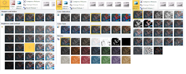 |
| PowerPoint Picture Tools |
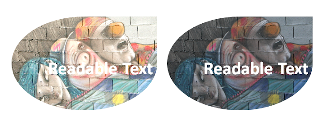 |
| Lightening and darkening effects of PowerPoint Picture Tools |
Floor Fade
A floor fade is where you add a transparent gradient layer over your image that subtly fades towards black or dark grey at the bottom, where you place your text. This fade will make your image look quite natural to the eye as the image is slightly darker at the bottom and the light will be coming from the top. It usually needs a bit of experimentation to get the level of transparency right.
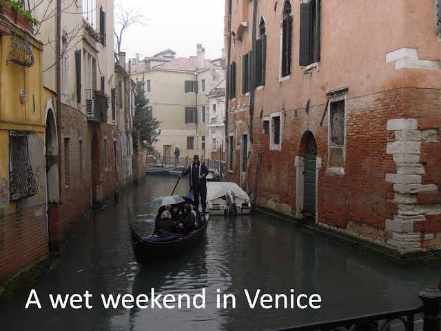 |
This floor fade is a bit too dark, we need to increase the transparency
|
To create the overlay, draw a shape either over the object with the photo fill or draw a rectangle over the entire slide if you are dealing with a photo background. The overlay is placed over the photo but behind the text in the stacking order. Then format the shape, choose a Gradient Fill, the Type is Linear, the Direction is Linear Up and the colour is black or dark grey and a Transparency of around 50%-60% is usually about right.
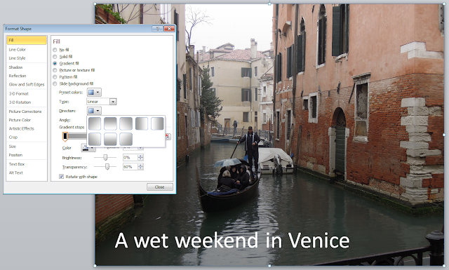 |
| Right-click the overlay, choose Format Shape and then Fill |
Invisible Mask
This is the one works best for me as it is so easy to do and requires far less flaffing around and experimenting in comparison to the other two methods. This method is a two-step formatting job. The first step is to apply a shadow to the text and then you format the background of the text box to black with a 95% transparency.
 |
| Background too busy for the text overlay |
Here's the usual problem, parts of the text are readable but the lighter areas of the picture are too pale to provide sufficient contrast for the text to stand out.
 |
| Shadow format for the text |
The Text Shadow control is no more than a hop over to the left from the Font Color control on the Home tab so you click the border of your text box, choose white text and then shadow. Already the text is looking more readable but it needs the mask to really make it pop.
 |
| Black background for the text |
A black fill colour for the text box certainly makes the text stand out but destroys the idea of the text being overlaid on the photograph. We shall soften it so that it forms a darkish background for the shadow.
 |
| 95% transparency, the magic mask |
Ninety-five percent seems to be the magic number for most backgrounds. 85%-90% is far too dark and anything over 95% has no effect. The mask is there, it's visible if you really look for it, most people will not notice it but they will be able to read your text.
I don't usually do the fill colour and then set the transparency in separate steps—I just wanted to illustrate the effect. All you need to do is right-click the text box and choose
Format Shape from the shortcut menu.
This method of creating a faint dark background to help a lighter element stand out is an old trick from traditional woodblock printing. It's got a proper name but I can't remember it. So I always call it the "magic mask". I thought you'd be impressed enough already that I'd remembered the word chiaroscuro.
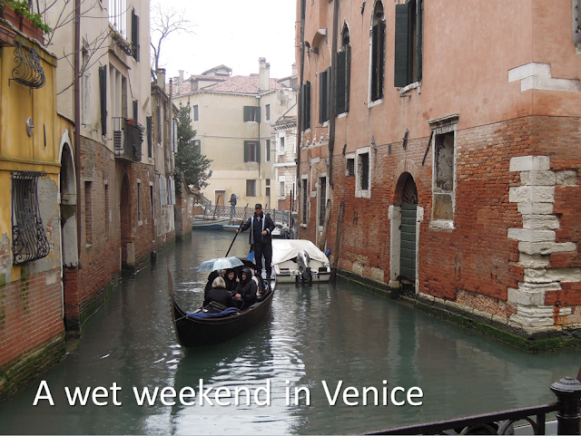 |
| The magic mask, it's only there if you look for it
|
Related Posts


No comments:
Post a Comment