Balance Diagrams
 |
| SmartArt Balance diagram |
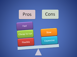
Have you seen the Balance diagram in PowerPoint's collection of SmartArt layouts? It's a really effective visual method of comparing the advantages and disadvantages of two different options.
You get two text boxes for headings and underneath them up to four items stacked on top of each other. The balance automatically tilts to the side with the greater number of items. Like all the SmartArt layouts, balance diagrams are very easy to do and you can format them with a couple of clicks.
You get two text boxes for headings and underneath them up to four items stacked on top of each other. The balance automatically tilts to the side with the greater number of items. Like all the SmartArt layouts, balance diagrams are very easy to do and you can format them with a couple of clicks.
Which of the two slides shown here is best, the balance diagram above or the more traditional opposing bullet points generated by the standard Comparison layout master seen below?
 |
| Death by PowerPoint |
Of course, it's a matter of personal opinion but I would vote for the balance diagram as it is visually more striking and better attracts the audience's attention. The eternal bullet points seen in so many presentations rapidly induce that awful "death by PowerPoint" syndrome. Those nodding heads, the heavy eyelids, such ennui...
Show people something attractive and they might actually listen to what you're saying. Another advantage of the diagram is that it obliges you to keep your text short and sweet. Any more of this and I'll have to create a balance diagram in favour of balance diagrams.
Show people something attractive and they might actually listen to what you're saying. Another advantage of the diagram is that it obliges you to keep your text short and sweet. Any more of this and I'll have to create a balance diagram in favour of balance diagrams.
Creating the Balance diagram
To create the diagram, insert a new slide using the Blank or Title and Content layout. On a blank slide, click the SmartArt control on the Insert tab, on a slide with a content placeholder, click the SmartArt icon. |
| SmartArt Graphics |
When the Choose a SmartArt Graphic dialog appears click the Relationship category on the left, the Balance layout is the first one in the gallery.
The SmartArt task pane opens on the left hand side of the SmartArt diagram. Enter the two main headings next to the two bullet points that are not indented, in this case Pros and Cons. Then enter up to four items for the bullets that are indented. Your items are stacked with the first item entered shown at the bottom of the stack.
When you have finished entering your text items you can close the task pane by clicking the Close box in the top right hand corner. To open it up again, click the arrow on the left hand side.
 |
| SmartArt task pane |
 |
| SmartArt Tools |
But it can be frustrating when you can't get exactly the diagram that you need. You have to work within the constraints of the SmartArt layout. What if you want more than four items in the stack or you want to remove the headings at the top?
The trick here is to convert the elements of the SmartArt to individual shapes then you can have exactly what you want. The trade-off is that it takes a bit longer to do.
To reduce the SmartArt diagram to individual shapes you need to ungroup its elements twice. Click the outside edge of the SmartArt, click your right-hand mouse button and choose Group, Ungroup from the shortcut menu. Then repeat the process and you have the individual shapes which you can now manipulate as you see fit.
 |
| Ungrouped balance diagram |
Four items were added to the original diagram, enough to tilt the scale in the right direction. Then the SmartArt was ungrouped, the headings were removed by pressing the Delete key and the extra item for the Pro stack was copied and pasted from an existing one.
When you copy and paste shapes they never arrive in the right position; either drag them or use the keyboard when you want fine control and exact placement. Pressing an arrow key moves a selected shape, holding down the CTRL key as you move Nudges the shape precisely.
Related Posts
Training Courses
If you've still got that "I just don't know what I'm doing" feeling then you might like to arrange a Microsoft PowerPoint training course for yourself or with some of your colleagues. It's really easy to book one of our courses and they're great value for money. See our website for full details.


