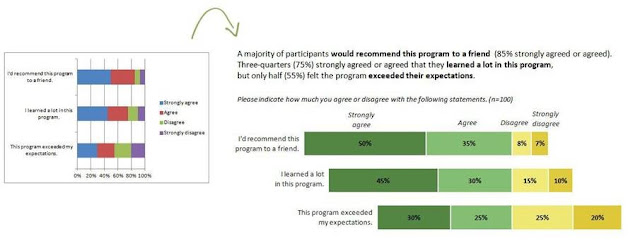
Working out your data category type helps you understand how to format the chart data markers in more meaningful ways. Try to determine if your data categories are nominal, sequential or divergent.
Nominal
Nominal or categorical variables are things like race/ethnicity (African American, Asian, Latino, White, etc.) or gender (male or female). Think about which pattern you want to emphasize, and use darker action colours to draw attention to that finding.
On your Excel chart, to format a single data marker click one bar to select the entire series and then click an individual bar to select just that bar. When you have the individual bar selected, right-click and choose Format Data Point from the shortcut menu so that you can change the colour.
 |
| Nominal data categories |
Sequential
Sequential or ordinal categories have a natural order, like age ranges (5-9 year olds, 10-14 year olds and 15-19 year olds) or years (Year 1, Year 2 and Year 3 of an evaluation). Sometimes categories go from less to more or from nothing to something. An example of a nothing to something progression is a satisfaction survey question that asks participants to assess how likely they are to recommend the product or service to a friend (not at all likely, somewhat likely, very likely). For these charts, the action colour can represent the something and white can represent the nothing:
 |
| Sequential data categories |
Divergent
Divergent categories are opposites, like agree/disagree scales on surveys. An example is a similar satisfaction survey question that asks participants to indicate whether they agree or disagree with the statement “I’d recommend this product to a friend.” When charting divergent variables, you might design a diverging stacked bar chart, as shown below. Select two different colours from your palette, like greens for agreement and yellows for disagreement. The extreme values (strongly agree and strongly disagree) get the darker colours.
 |
| Divergent data categories |
Chart Colours
 |
| Theme colours |
So that you don't have to keep mixing your own colours try choosing a different colour theme and then the new colours will be shown in your charts gallery.
Themes are palettes of colours that are designed to complement each other. Change the theme and you will see the new palette is available and it's easy to select both dark and light colour shades.
In Excel 2010, colour themes are available in the Themes group on the Page Layout tab.

No comments:
Post a Comment