Wednesday, 13 June 2018

Excel - Data Validation Restricting Cell Entries

This and additional Hints can be found on our website - Training Materials

It is possible to restrict cells so that only certain values can be entered into them, by controlling what data is entered into a cell will make worksheets more reliable.

For example you may require a column to only accept numeric numbers for calculations, therefore you may wish an error message to be displayed if any other value is entered like text.

In the Example below we want to allow only a who number between 10 and 20 to be entered in column ‘A’.


Data Validation Building a Drop-Down List.


A drop-down list could contain a list of departments that you choose from, this way a user must select from the list not typing in the data manually causing errors, for example typing a department two different ways ‘HR’ or ‘Human resources’.


Excel - Creating Scenarios


This and additional Hints can be found on our website - Training Materials

A Scenario is a named set of values that are saved and can then be substituted into your worksheet.

You can create and save different groups of values on a worksheet and then switch to any of these Scenarios to view different outcomes.

In this example we will build on our previous solver example.

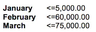
The previous example we had monthly figures for London region,(“January – March”), which we applied constraints to each of the months so that we got a final value of £140,000.00.
The constraints were as followed.


Now in this example we will add three different scenarios for the “London” region for January.


In the previous example we only defined one set of constraints for each month, then viewed the results on a new worksheet.

To create multiple constraints (scenarios) for January follow the above steps for solver to step 9 then


To add multiple Scenarios repeat the solver steps 2 through to 9, but instead of adding constraints select the desired constraint and select the Change button, enter the new constraint solve as before but select a new name for each scenario.


Viewing saved Scenarios.

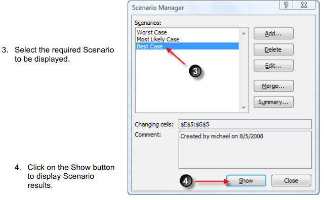
In the previous example we created three different scenarios (Worst Case, Most Likely Case & Best Case).

To View saved scenarios.


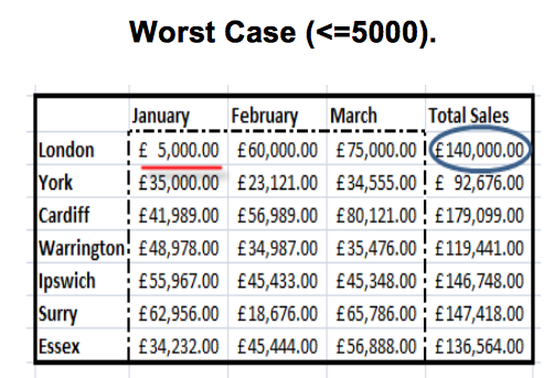
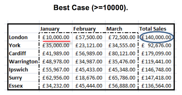
The below results display the Worst Case & Best Case results for January, given that t he Total Sales for months January – March total must be £140,000.00


It is also possible to view graphically the scenario results by selecting the Summary button from the Scenario Manager dialog box. (see above dialog box).


Tuesday, 12 June 2018

Visio 2013 - Quick Start Guide

Quick Start Guide

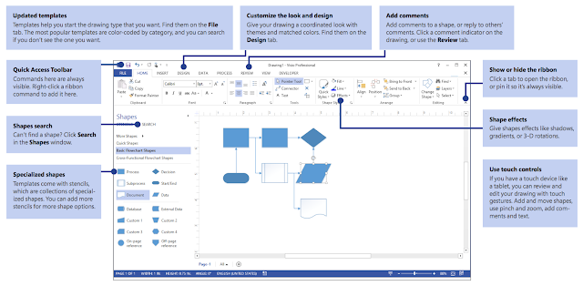
Microsoft Visio 2013 looks different from previous versions, so we created this guide to help you minimize the learning curve.


Get a jumpstart on your work

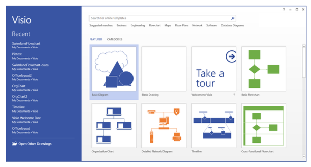
Visio comes with dozens of templates to start you quickly on almost any type ofdrawing, from organization charts to network diagrams to oor plans to wiring diagrams to work ows and more.


Each template includes shapes related to the type of drawing, in specialized collections called stencils. 

The Shapes window, at the side of the drawing, holds the most popular stencils and shapes for the diagram type you’re making.

To begin, drag shapes from the Shapes window onto your drawing.

Make your drawing look professional

Just a few clicks can give your drawing a professional and engaging look. Use a theme to apply a coordinated set of colors, or customize it with one of the color variants. Find galleries for both on the Design tab.
Roll the pointer over each gallery option to get a live preview of what your drawing would look like.


You can also add more visual impact to shapes. Visio now lets you give shapes thesame effects — such as ll colors, gradients, shadows or 3D effects — that you can add to art in the other Of ce programs. Use the Shape Styles group on the Home tab.


Things you might be looking for

Use the list below to nd some of the more common tools and commands in Visio.

Excel - Creating a Shared Workbook

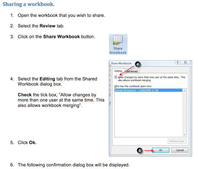
It is possible to share a workbook with others when working in an networked environment.
By sharing Excel files users can:

Add columns and rows. Enter and modify data. Apply formatting.
Track and review changes
.

“[shared]” will be displayed in the Excel title bar to indicate that the file has been saved as an Excel shared file.

Shared workbooks work well within teams that require joint responsibilities over the workbook data.

If users modify the same cell, Excel can keep track of changes (history), the changes can be reviewed at a later date and be accepted or rejected.


Click Ok to save you workbook


Modifying Shared Options.


Excel - Controlling the Worksheet Display

Multiple Windows

Multiple windows allow you to:

Display as many windows a you want within the workbook.


In the example below we are looking at the ‘customers file’, but looking at the same time two different sheets.

Display Windows that contain separate workbooks

Copy data between sheets. 

The Process:

Open the required file.

From the Ribbon select the View tab → New Window icon.


To position the windows side by side select the View tab Arrange All icon.

The Arrange Windows dialog box is displayed.


Select the layout option required.

In this example we have selected Tiled.

Click OK.


The Windows are now displayed side-by-side.

Notice in the preview below the workbook names, Customer:2, Customers:1.

Customers1 is the original view, every time the New Window option is selected the additional view name will increase. (Customers:1, Customers:2, Customers:3 etc).

It is now possible to move your cursor between each of the views, selecting different areas in the workbook in each view.


Freeze Panes
Freeze Panes is very useful when working with a Table, a Table can consist of thousands of rows and columns.


The problem is when you scroll down the table the headings will disappear from the top of the page.


Freeze Panes will allow you to lock the headings at the top of the page while scrolling down the table.

The Process:

If the headings are in row 1 between columns A:G, highlight row 2 in the left margin.


From the View tab, select the Freeze Panes icon.

The titles will now stay displayed at the top of the page until theUnfreeze Panescommand is selected.


Zoom Magnification.

In some case you will need to change the zoom magnification of the worksheet.

This will either make the diasplay of the data entered either look larger / smaller on screen.

The zoom controls will not effect the size of the data text when printed out on paper, it is for screen use only.

The Process:

Select the Zoom icon from the View tab.


Select the required magnification and click on the ok button.


Additional Zoom features.

100%, this will restore the spreadsheet to the default screen size layout.

Zoom to Selection, highlight the data that is required to be viewed.
Select the feature, the area


highlighted will be zoomed to fit the page.

The Zoom tool can alos be accessed by using the Zoom scrollbar found at the botton right of the screen.


Excel - Creating a Chart

Charts


What is a Chart?

A chart is a graphical representation of the worksheet data.
The chart is linked to the spreadsheet data therefore if the spreadsheet data changes the chart will update automatically.

Chart Terminology

Title – Identifies the overall data that is represented in the chart.Handles – Indicate that you can resize, move, copy, or delete.

Gridlines - Horizontal lines, one for each value on the ‘Y’ axis, males the data easier to read.

Legend – Identifies the various data series in the chart.


X-axis – The horizontal axis of a chart.

Y-axis – The vertical axis of a chart.

Data Marker – Represent the various data points in the chart.
In this example the Data Marker are bars, as the chart is a column chart.

Data Series – A range of data points in a chart, such as bars, columns or pie slices.

Creating the Chart

Highlight the data that you wish to plot.

Select the Column chart from theInsert tab.

In this example we have selected a 2- D column chart.


The chart has now been created and I displayed under the original worksheet data.
It is possible to move the chart around using the Handles located in each corner of the chart.


Moving the Chart to a new Sheet

When the default chart is created, the chart is placed on the same sheet as the data it is linked to. It is possible to move the chart to a new sheet.

Process:


From Chart Tools, select the Design tab → Move Chart icon.


Select an existing or new sheet that you wish to place the chart.


Locating Additional Chart features.

The additional chart tools are found on three tabs located on the Chart Tools toolbar.


Adding Additional Data to a Chart

Once the chart is created it is possible to add additional data to the existing chart. 

The Process:

Enter the new data to the Excel Spreadsheet. 

Select the chart you wish to update.

Click on the Design tab under chart tools, select the Select Data icon.


The Select Data Source dialog box is displayed. 

Click on the Add button

In the series name box, select the additional series name (heading).

In the series value box, select the value to be included in the chart.
Click on the OK button


Excel - Auditing a Worksheet

Trace Precedents & Dependants.


The formula auditing tools can be found on the Formulas tab on the Ribbon.
Select Formulas Tab from the Ribbon.


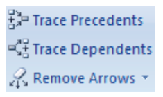
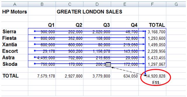
Formula auditing uses the terminology Precedents and dependents. Precedents are the cells that provide data to a specific cell and Dependents are the cells that depend on or are affected by the value of a specific cell.

Select the cells that contains the formula for which you want to find the precedent or dependant cells and click either the Trace Precedents or Trace Dependants buttons to display the tracer arrows. One click shows the first level of precedents or dependents; keep clicking to trace through the original or terminus of the calculation.


Blue Arrows: are displayed to show all the cell relationships.

Red Arrows: are used if a cell contains an error value.

Black Arrows: pointing to a worksheet icon is displayed, if the cell reference is on another worksheet. Double click on the black arrow to display the GoTo box that will display the linked worksheets.

The other workbook must be open to continue the trace. Click on the Remove Arrows to remove all Auditing arrows.

Watch Window.

When working with large or complex worksheets, where the result of the formula is dependent on the results of another formula in another cell, you may want to monitor
cell values. 

To do so, you can use the Watch Window. To add a cell to the Watch Window, click Watch Window


from the Formula tab in the Formula Auditing group. The Watch Window is displayed. Click and drag to select the cells you require to watch and then click Add.

Excel - Assigning a Macro to a Toolbar

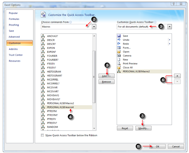
After you have created a macro it is possible to add the macro to the Quick Access Toolbar.


1. Click the Customize Quick Access Toolbar → More Commands.


    1. Click the Choose command from → Macros.
    2. Click the Customize Quick Access Toolbar list arrow → For all documents
      (Default).
    3. Select the macro you wish to run.
    4. Click Add.


    1. To arrange icons use the Move Up and Move Down arrows.
    2. Click Modify.
    3. Type a name for the button.
    4. Select an icon in the symbol list.
    5. Click Ok.
    6. Click Ok – The icon will now be added to the Quick Access Tool


Monday, 11 June 2018

Introduction to Microsoft Power BI

Introduction to Microsoft Power BI

It all starts with the dataset, which simply means the data you have connected to. These datasets are then added to reports as visualizations, which present that data in a graphical way. 
The Power BI web and mobile apps go a step further with dashboards, which allow you to collect visualizations from different reports into a single location. 


Each dashboard is made up of tiles, which are simply visualizations linked back to the original report. These dashboards can be collected into workspaces.
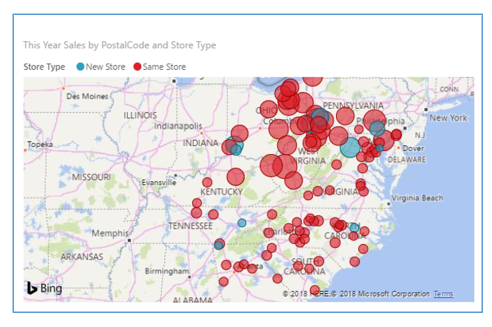
For example, sales by region might be presented as a map, with a bubble representing each amount:
The Query Editor Interface

On the left (1), you will see a list of queries, with the data displayed in the center pane. Its settings can then be modified using the commands on the ribbon (2). These settings are listed in the Query Settings pane (3), which we will take a closer look at in a moment. Once you have finished making your changes, click Home→ Close & Apply (4).

Managing Report Pages
Showing and Hiding Pages

To temporarily hide a page, right-click its tab and click Hide Page:
The page tab will then be grayed out. You can show it again by right-clicking the page tab again and de-selecting Hide Page.
You can use this same right-click menu to duplicate the current page, rename the page, or delete it

Changing Page Order

To change the order of pages, simply click and drag the tab:
Release your cursor when you have reached the desired location.

Navigating Through Pages

To view a different report page, simply click its tab at the bottom of Report view:


The Web App Interface
1. App Launcher
2. Breadcrumb Trail
3. Office 365 Commands 
4. Search field
5. Navigation pane 
6. Canvas 
7. Get Data